




2026 Fit Planner - Black Metallic
Once this limited-edition planner sells out, it won’t be back. Grab yours while you can!
Features + Fit
Fabric + Care
Materials + Care
Performance Level
Bundle Details
Shipping + Returns
Shipping:
FREE SHIPPING in the U.S. on any order over $125!
Under $125, it's $7.95 in the U.S. (+$2 for yoga mats and bags)
For more info on shipping including international, please read here.
Returns:
Returns are complimentary with Checkout+ and are accepted within 30 days of purchase. Without Checkout+, you can purchase a return label inside the portal. Items marked as final sale and gift cards are not eligible for return. All refunds are refunded to the original payment method.
Exchanges:
If you're in the U.S and have Checkout+, you are eligible to make as many exchanges as needed to achieve your perfect fit, as long as all exchanges are done within 30 days of purchase. If you opt out of Checkout+ we offer two complimentary U.S. even exchanges within 30 days of purchase. International orders are not eligible for exchange as we are only able to accept returns from customers shopping outside of the U.S.
For more info on returns + exchanges please read here.
Not sure how to measure? Scroll down for Measuring 101!
Imperial Size
How to measure👇

really happy with this planner; worth every penny IMO and cant wait to see next years ! would love to see more space for additional notes on the daily sections next time though
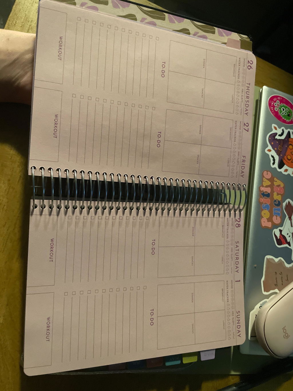
This planner is thick! I love it so far. Is it crazy to think I want it bigger? lol I would love for there to be some reflection questions everyday. Maybe something like “what are you grateful for today” and “what’s one thing that made you smile today”. I love that this is a fitness planner but I would love some mental health reminders in there on the daily. Other than that, I love it!
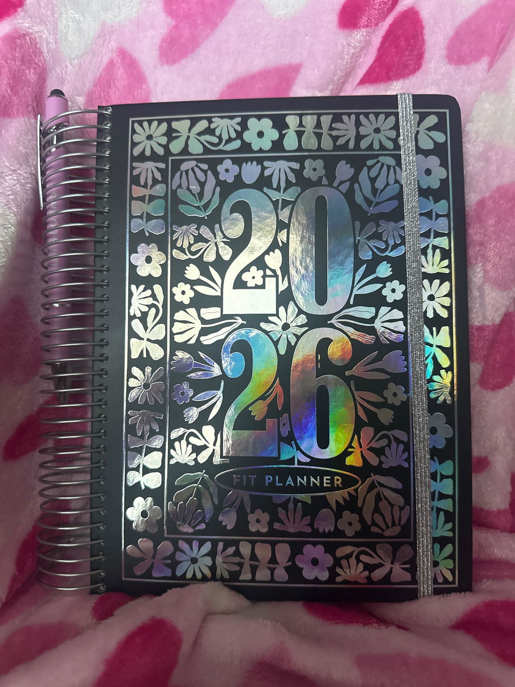
Thanks for the review! I’m so glad you’re loving it so far — and no, not crazy at all about wanting it bigger. We love your idea of adding daily reflection prompts and mental health reminders. I’ll pass that along to the team.
This planner is everything I have ever wanted AND MORE 😍 I started therapy this year & this planner allows me to track everything in one place. I used to have to make my own trackers or use like 10 apps & it would be so overwhelming I’d give up. I’m just sad that I didn’t get the one with stickers 😭 I didn’t realize there was another option. I am so excited to use this!
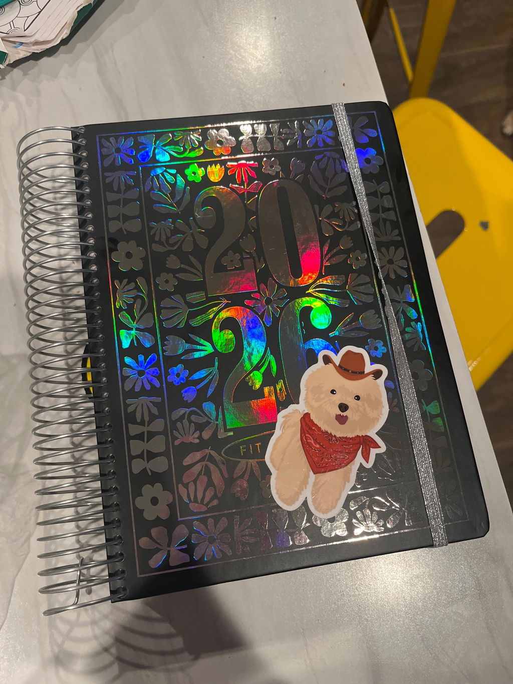
I’ve purchased Cassey’s planner for the past few years, and this is my third year ordering. My husband purchased this under his account for me and unfortunately, this is the first time I felt disappointed after opening it. I want to share my feedback thoughtfully, because I’ve always admired the care and creativity that goes into her designs, and this planner has been something I genuinely looked forward to every year.
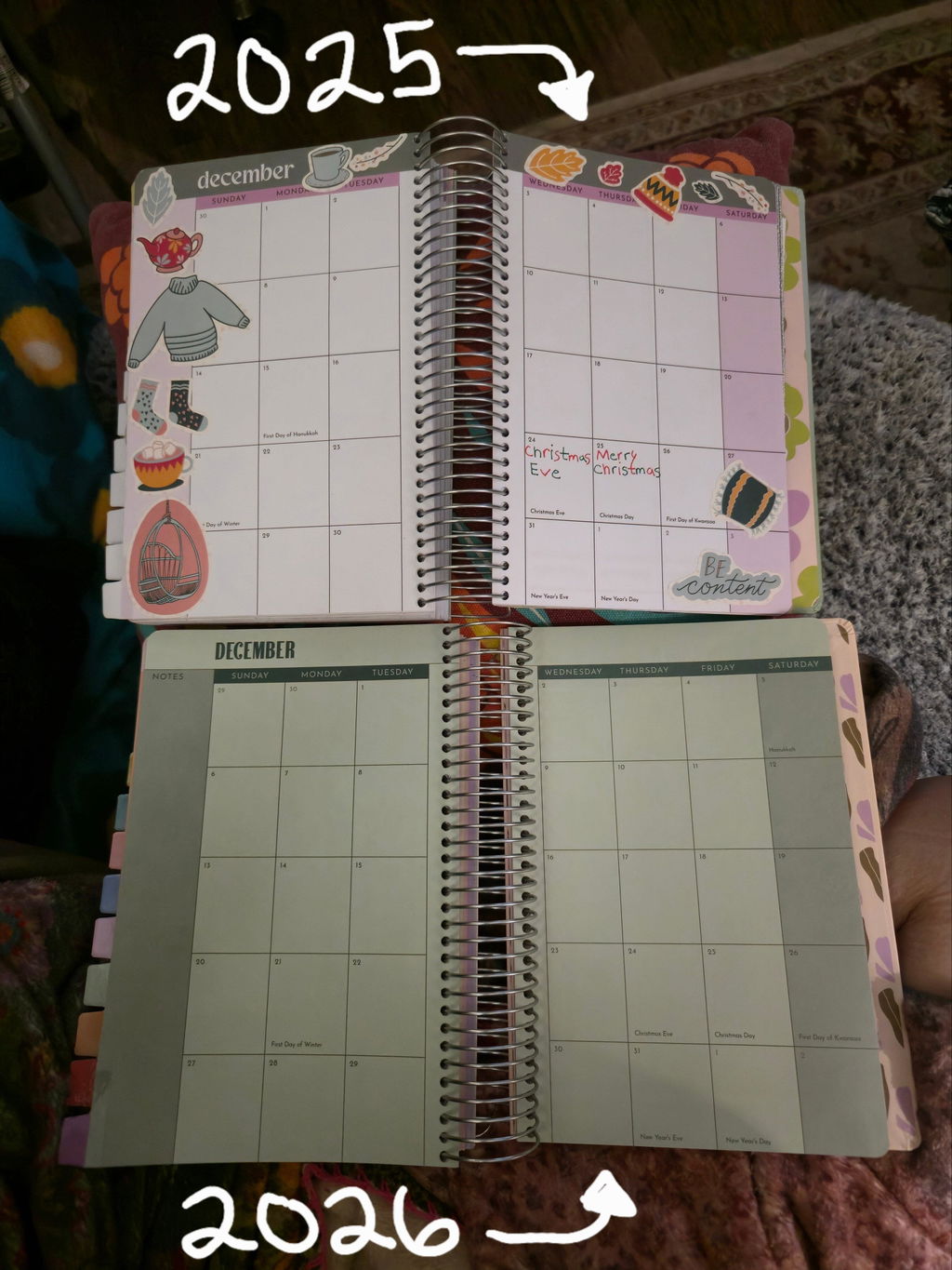
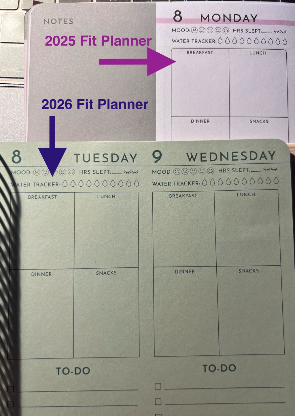
In previous years, the planner felt very intentional. The white backgrounds paired with fun, colorful headers and accents made each month feel fresh and vibrant. The pages popped without being overwhelming, and the white space made it easy to decorate, draw, color, and write using a variety of pens and inks. That balance between color and white space was one of the main reasons I loved and chose this planner.
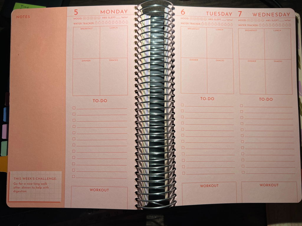
This year’s design feels very different. The removal of white backgrounds from the monthly calendars, workout planners, and weekday sections makes the pages feel muted and monotonous rather than lively. The overall color palette feels flat, and nothing really stands out on the page anymore. As someone who enjoys decorating, drawing, and color-coding with pens, the colored backgrounds make it much harder to use different ink colors and enjoy the creative aspect that used to be such a highlight.
From a usability standpoint, the colored backgrounds are also harder to read. For users who struggle with blurry vision or visual fatigue, white pages with color accents are much easier on the eyes. The previous designs felt both visually accessible and creatively flexible, while this year’s feels more restrictive.
I’ve watched Cassey design products for years, and her work usually feels very thoughtful and well-considered. This planner, however, feels like it may have been rushed or placed on the back burner. The monthly pages in particular feel basic compared to last year’s colorful, intentional layouts, and the overall look comes across as less polished than what I’ve come to expect.
I was also disappointed that the stickers now cost extra. In past years, stickers were included and felt like a thoughtful bonus that complemented the planner experience. Considering the planner still costs $39 (and $47 with stickers), the value feels lower this year—especially when the design itself feels more minimal and less engaging. With how neutral the pages are, including a free sticker booklet would have gone a long way.
The cover is beautiful, and I truly hope the print holds up better than in previous years, as I’ve experienced rubbing and wear before. But overall, I honestly feel that reprinting last year’s design with updated dates would have been a stronger option than the current redesign.
I’m sharing this feedback not to be harsh, but because I’ve loved this planner in the past and know how much talent and effort usually goes into these products. I truly hope future versions return to the thoughtful balance of color, white space, creativity, and usability that made previous years so special. I've included some pictures of the 2025 and the new 2026 version for comparison.
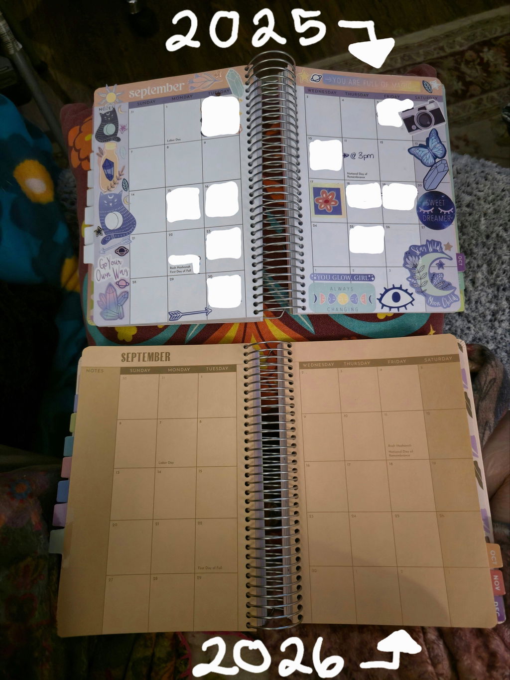
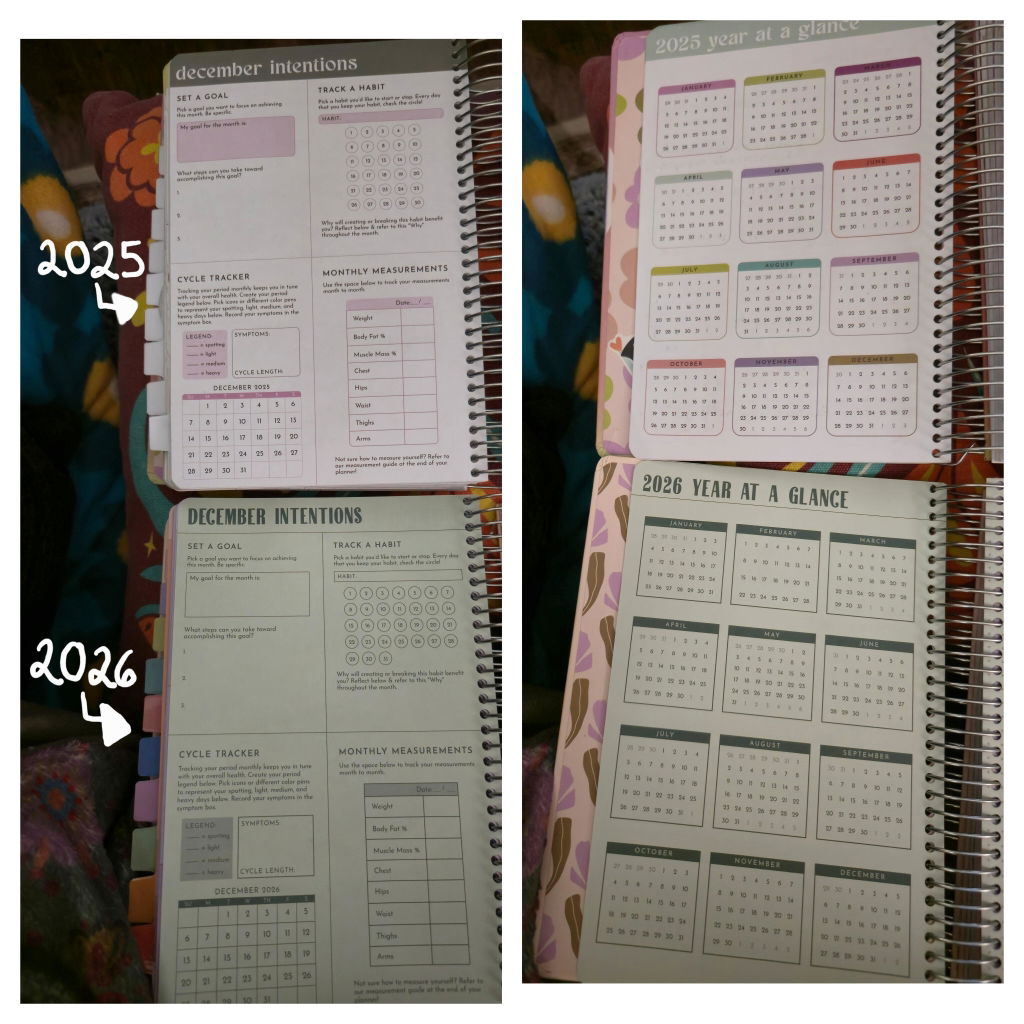
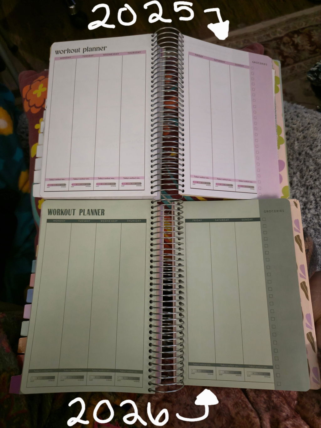
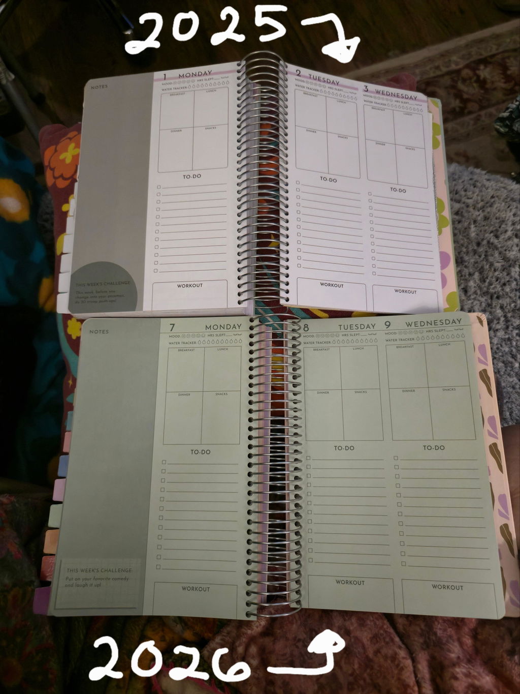
It’s a beautifully designed planner with an intentional layout and I think the best option of any other planners. I have been getting them every few years since 2016. I really love them. But this year the paper is colored which is really hard on the eyes, difficult to read, and I think looks bad. I really wish they had done it how they have in the past. It doesn’t even look that bad in pictures, it looks worse in person.
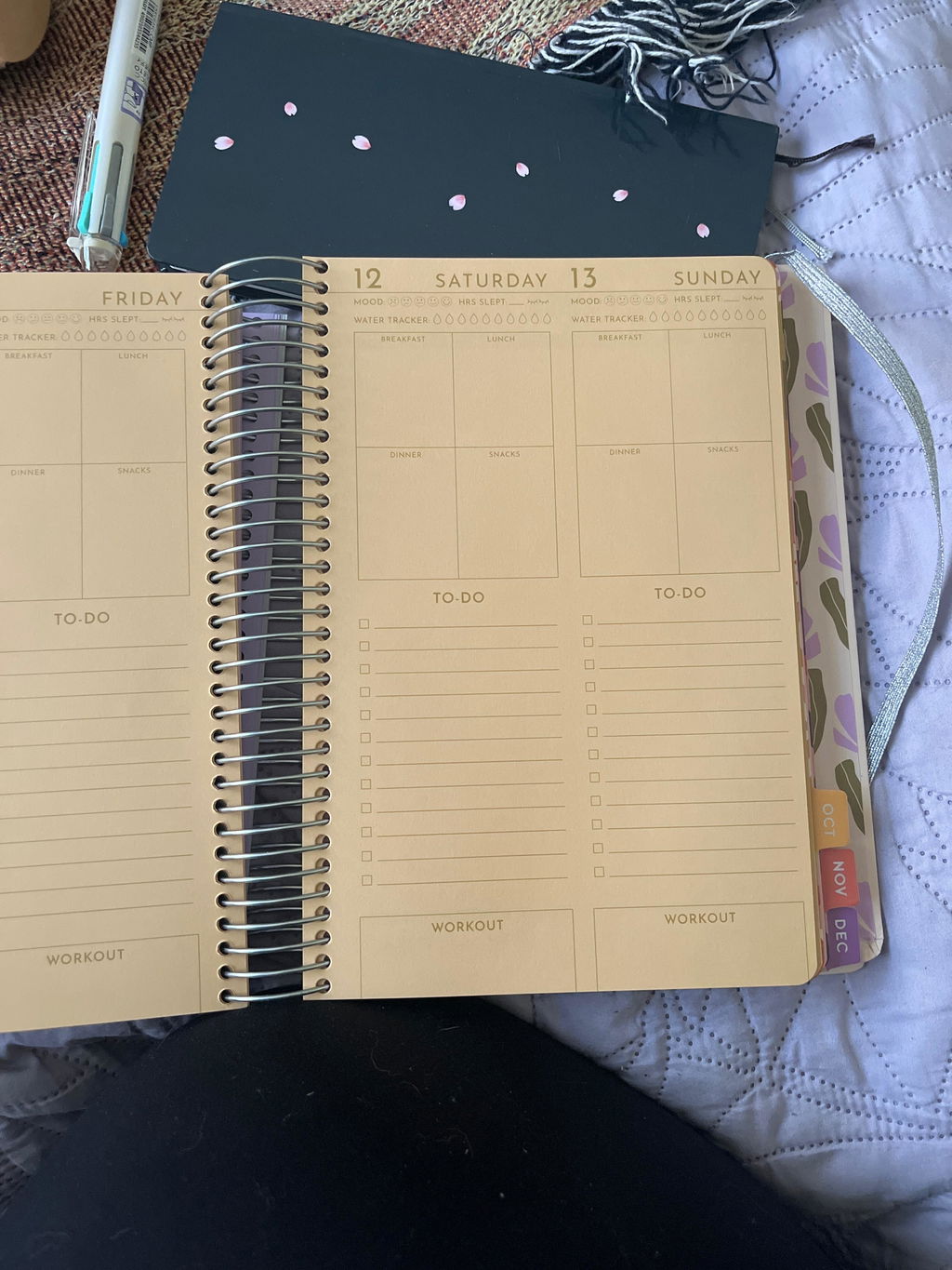
I got my first planner in 2025 and fell in love with the layout and the yearly/monthly check-ins. Everything about the layout is pretty much perfect! So I ordered the 2026 planner without even looking at photos or putting much thought into it. Personally I didn’t even like the cover, but the inside is what matters more. I opened my package today and the page colors are off putting and so dark. If someone wanted to use different colored pens or highlighters, I can’t imagine what it would look like. Even when I take a photo on my phone, the pictures make the pages look better than it does in person.
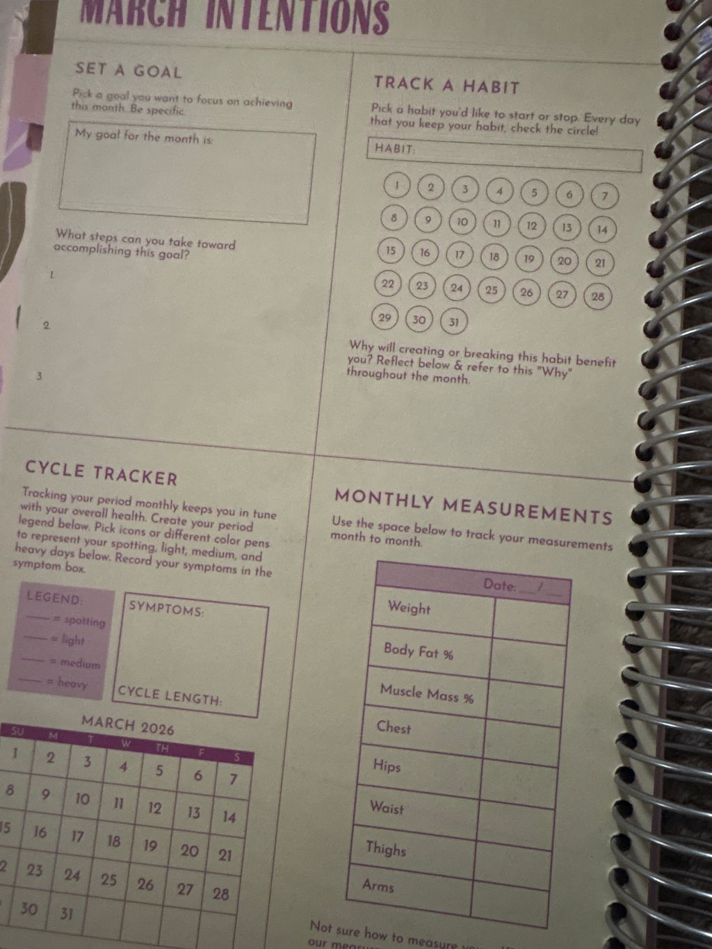
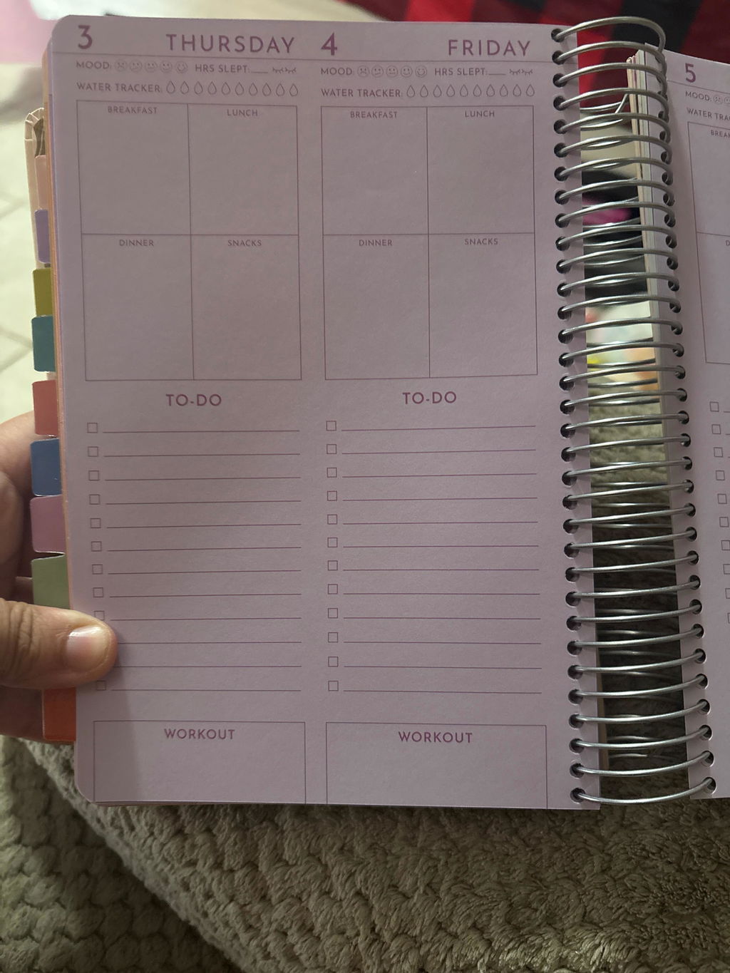
I have mixed feelings... I have been religiously buying the fit planners since 2020, and only once (2024, I believe it was) have I not given these 5 stars. In 2024 (crap, or was it 2023?), I gave 4 stars because the weekly columns between the weekly to do lists for workout routines or daily musings were removed, but everything else was as great as I'd expected, and I was relieved in 2025 this was fixed and the columns came back. I'm writing this review in the hopes that, in 2027, this new problem I have might be fixed, too. I appreciate the bold effort in trying to spruce up the stark whiteness of the pages, but unfortunately, the tint on EVERY page is just too dark. In my pics below, I have the flash on, but it's still hard to read. Without it, you couldn't even see the words! Other reviews say similar, that the pictures make it look brighter, but even then, still too dark. A lighter/softer hue could've worked depending on the chosen background colors, but these didn't land, unfortunately. This could've been a cool unconventional idea, but the chosen color tones aren't friendly at all to the visually impaired. I actually am horrified at the idea of a colour blind person trying to use these planners because, depending on their type of color blindness, they probably won't be able to use this at all. My husband is color blind in one eye from an old accident he'd had, and he said looking at this made his eyes hurt after a few seconds, like maybe they were straining too hard or the color combos were giving him a headache. He regularly looks through my planner so that we can co-ordinate plans and tasks together and he can keep up with ours and the kid's appointments and whatnot, and this color scheme has thrown a monkey wrench into that regular routine because he can't bare to look at it. When trying to write in it or read the headings, nothing pops off the page or stands out brightly like it usually does. I love using different colored pens to help me see things better and to complement the colors already in the book's template, but aside from black, blue, or red ink, nothing is gonna show up well on paper this dark. The cover is absolutely gorgeous, the front and back are as lovely as ever, and I'm so glad it's still holographic. I still live my columns, my period tracker, my water tracker, my meals squares, my monthly goals and habits, my neatly laminated tabs; I'm extremely happy that those haven't changed! I like most of the monthly starter tab pages that state the name of the month, but two of them in particular are extremely busy. I dislike January and November immensely. I may have to wear super thick glasses, but I still don't think the color combo and busy patterns should be so annoying to glance at. The other month tabs are very pretty and fit the theme of the cover, but wth happened with Jan. and Nove.? They don't match the overall theme in the slightest. The florals of the other tab pages are giving soft pastel "70s flower power" vibes, but the weird geometric shapes in those ugly color blocks don't give 70s at all, it's giving more "early-90s bad art in a Silicon Valley corporate office ala proto-Tech Bro." Very jarring and off-putting to look at. I know that sounds harsh, and I hate that I'm writing that about my beloved Fit Planners, but I deeply dislike that design choice, considering I'm going to be using this for the whole year. My order arrived super fast to Australia, and as always, I adore the sturdiness of the keepsake box. The thoughtful packaging and the little details that obviously have care put into them always shine through, and I want the Popflex team to know: I see you, and I appreciate you! Especially the Sir George stickers, I collect them and I giggle in delight every time I find him hiding in my delivery bag 🥰 I love his different lil outfits!!! This time he came wearing an adorable neckerchief and cowboy hat, he's such a dapper lil fella! My stickers that came with the planner are so bright and cute, and as fun and useful as ever, so wth happened to the inside pages? Thank goodness for the stickers, they'll help things stay noticeable on the paper when I put them next to what I write, but it seems like someone along the way got confused with the nature of the theme, as some elements of the overall design clash with others. I have to wonder if maybe whoever is developing these for Cassey is starting to run out of ideas for these year after year? I don't think Cassey has too much time anymore to devote to fully creating these, so maybe that's why they're starting to look so different? 2025 was a good reliable planner, and that's the big reason why I bought it (and this one, too), but the overall design wasn't as exciting as the previous years' covers and interiors, and I stated as much in my review last year. This year, the cover is extremely exciting and eye catching again, but the interior leaves much to be desired in the no-longer-white pages.
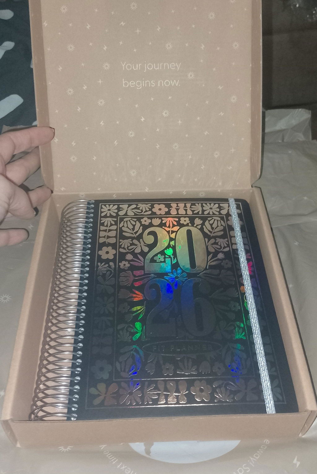
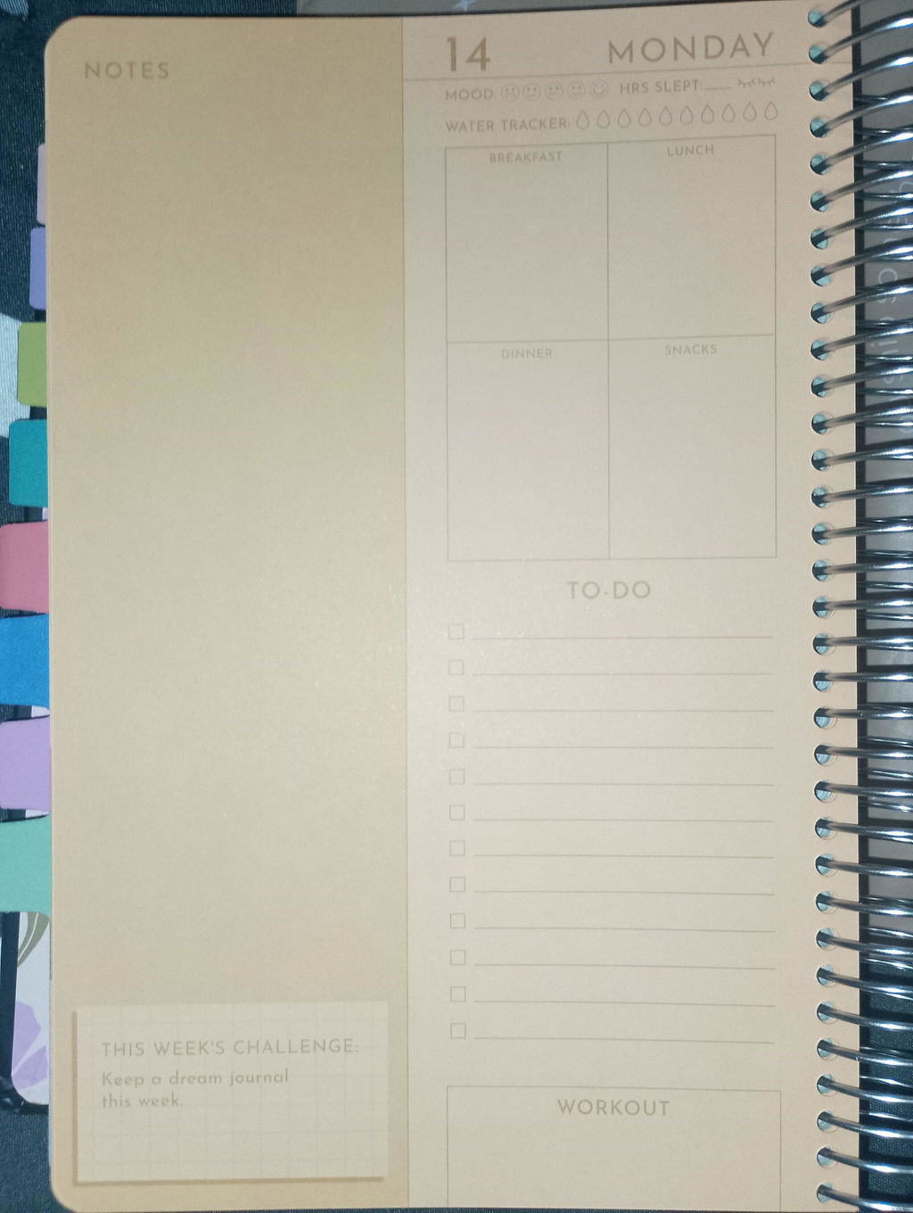
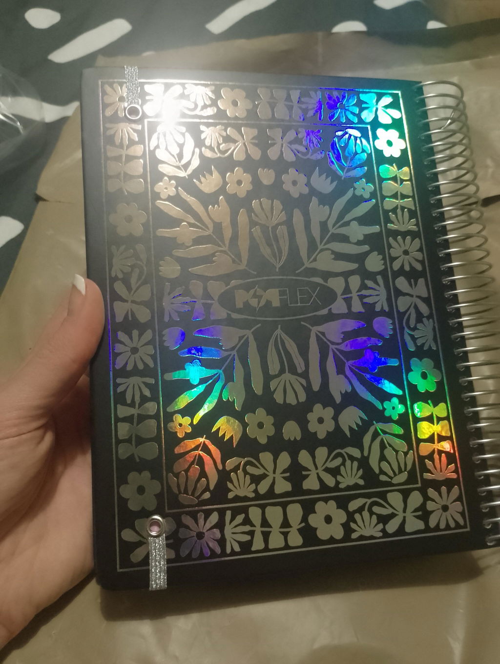
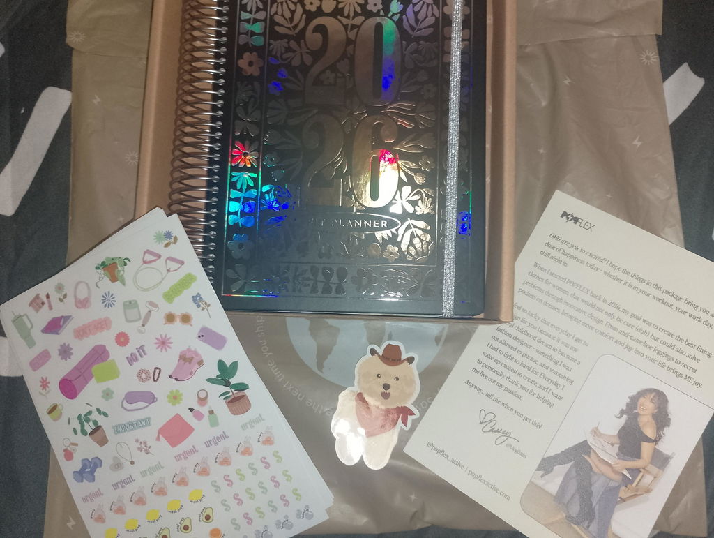
I've purchased the Fit Planners every year since 2020 and love them! My 2026 Fit Planner arrived today and the dark color paper inside is not enjoyable to look at (or write on with colored pens or highlighters). Especially the orange pages in September… yuck :(
I really do love the Fit Planners, but the color paper this year is not the vibe. It's with sadness I suggest skipping this year's planner.
I started the return process, but would have to pay an $8 return shipping fee :(
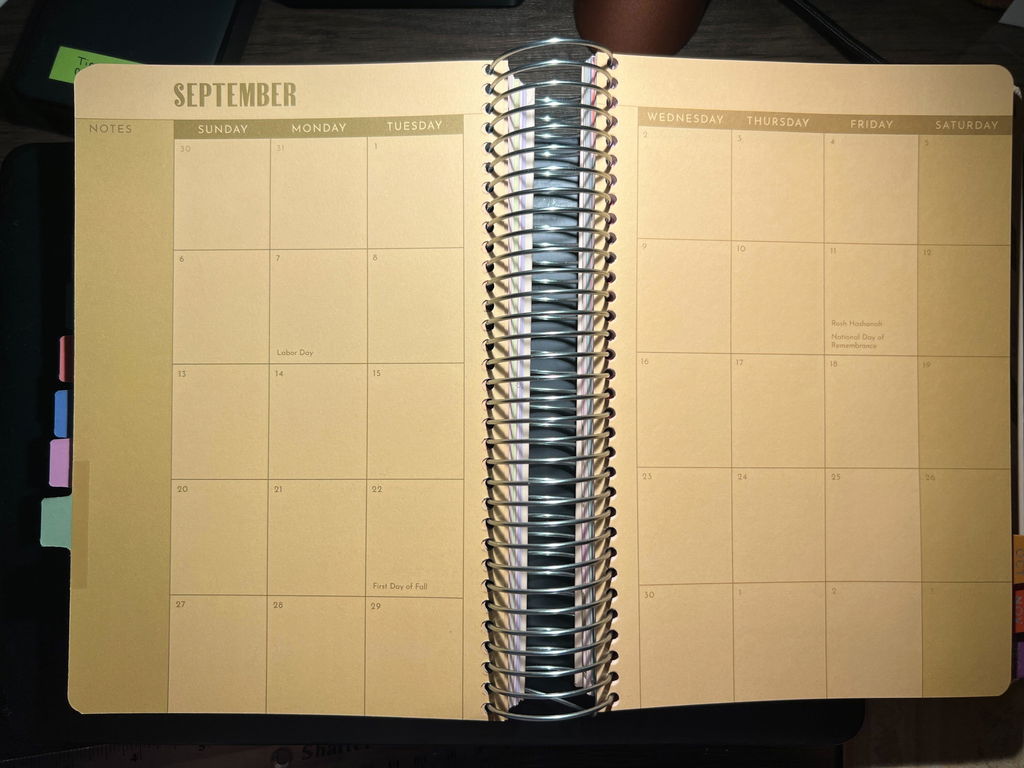
I love these planners and have been buying one every year since 2018. It’s my favorite way to reflect and focus. I love all the thoughtful details, workouts and recipes in them! The design is so cute.
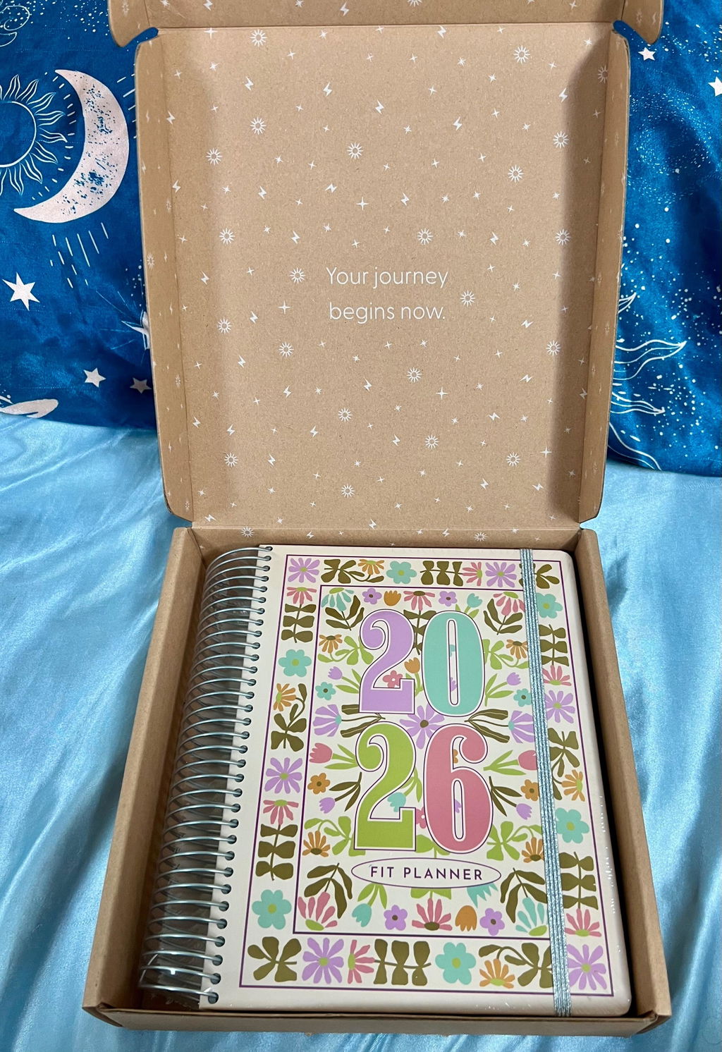
Thank you so much for your kind words and for being a loyal customer since 2018. We're thrilled to hear that our Fit Planner has been helping you reflect and focus each year. We put a lot of thought into the details, workouts, and recipes included in our planners, so we're glad to hear they are appreciated. And we couldn't agree more, the design is definitely cute! Thank you for choosing our planner as your go-to for staying organized and healthy. Happy planning!
I’ve gotten these planners for 3 years in a row now, and I was super looking forward to getting my 2026 edition! When I saw that each months pages were tinted a different color, it really threw me off. This is because it’s quite dark (in my opinion) and will make using any colors other than black ink unreadable. This is probably not a problem for many, but as a “different pen colors mean different things” organization girlie, it really reduced my options for how I write in my planner. (I love my different color highlighting!) Adding a photo example just so buyers know what to expect. I don’t think highlighters will even show up now. I would just suggest a lighter page color in the future. The white used to be great and also made the other color areas on the pages stand out.
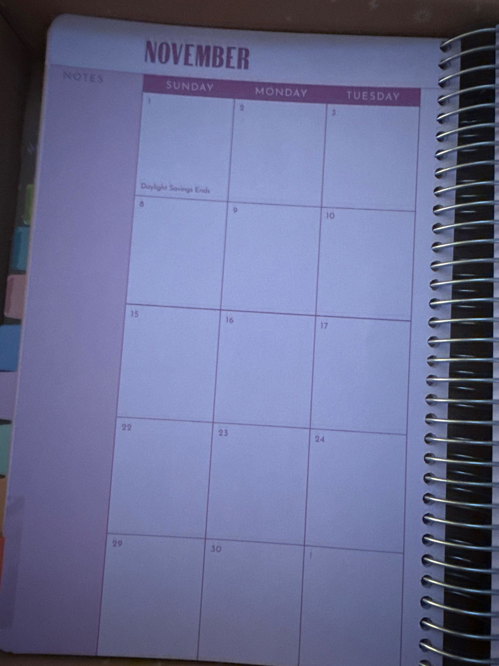
I've bought so many planners over the years, and this is the first time one has actually stuck. I absolutely LOVE the way this planner is formatted. It's so, so helpful to have the daily to-do lists, the monthly calendar (my most-used section) is big enough for me to write down everything I'd put in a full-sized calendar, and I enjoy the monthly goal pages, trackers and check-ins. I have basically no notes-- this planner is everything my failed bullet journal was trying to be last year, and it's super cute to boot!
So I love this I'm theory but in practice I already have multiple trackers that I have to use on my phone (tracking macros, workouts, measurements) and a goal diary. So I haven't made much use of it! I'm going to try for the second half of the year and see how it goes!
All the tabs that are included and attention to detail put into this planner is amazing.
I'm glad I decided to be a planner girlie this year! It has held up very well even with 6 months of use. The only complaint I have is that the weekly view doesnt have the date numbers. But I do love the month/werk/day breakdown. And the color pallete is fun. Will definitely look forward to getting a 2027 version!!
3.5 stars
Had the 2025 planner. Most issue with the monthly calendar want each day of the month to have its own box and not share. The habit and the cycle tracker should just be numbered to 31 instead of 30 because some months are longer. Wish it had a page just for meal planning for the month. Then shopping per week. The two weekly layouts aren’t an issue that much. Would have bought 2026 but the cover reminded of 2025. And an option to get a measurement tape that’s offered in the old blogilates 12 weekfit planner. Enjoyed the stickers. Enjoyed everything else. Loved the recipes and workout ratio
Super aethetic and also versatile for easy use!
I love this planner, it actually helps me stay organized and keep track of my goals. The only improvement I would make was to put at the beginning of the month the challenge for that month to help get a better track of it. But still love it! Would definitely buy next year planner.
This planner helps me stay so organized, I’m able to track everything I need to plus more! I’ve tried dozens of different ones available but this one is hands down the best one Ive ever used.
I really wanted to get more organized this year and it’s so satisfying seeing all that I have accomplished and keeping if all organized


